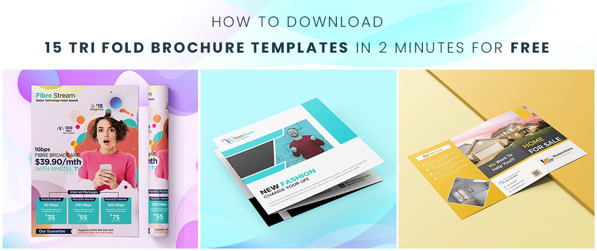
How to Download 15 Tri Fold Brochure Templates in 2 Minutes for FREE
No matter how much we argue, offline marketing techniques are here to stay and still have a good influence, even in this digital age. Trifold brochures are one of the best modes of communication to market your brand’s message and advertise your products.
A trifold brochure comes with three sections with a front and a backside. So, in total, you have six whole sides to promote your brand and your product. One of the best things about using trifold brochures is that you can practically use it for any business irrespective of the industry, the products or the size of the company.
However, there are many who don’t actually make use of the wonderful opportunities a trifold brochure presents. The design of the trifold brochure matters a lot when you aim to create a lasting impression.
If you are thinking that you need to spend a lot of money to design a good trifold brochure, then think again. In this blog, we will see some of the main features and design elements that a trifold brochure needs to stand out, attract and convert and some stunning templates of trifold brochures that you can use.
Table of Contents:
1. How Can You Use Our Trifold Brochures?
2. What Are the Essentials in a Trifold Brochure?
3. 5 Design Tips to Make a Great Impression with Trifold Brochures
How Can You Use Our Trifold Brochures?
Our design experts have created different templates of trifold brochures with amazing colour schemes, designs and content positions that work the best. You can download any trifold brochure templates free of cost now. Just click on the below link to get these brochure templates and much more delivered right to your inbox.


Once you have downloaded the template, there is just very little left to do!
- Choose the template in which you want to create the brochure and open it in Photoshop.
- You can see the editable sections. If you want to retain the design, just add the content, icons and images.
- If you want to change the colour schemes, you can directly click on the sections and choose the colour you want.
- Once you have completed editing the template, save it directly and you’re done!
You can use these 15 templates for trifold brochures to create numerous varieties of brochures.
What Are the Essentials in a Trifold Brochure?
- The contact details of your company with an email address, a phone number and the social media handles, if possible.
- A clear call-to-action, something which is the main intent of the brochure. Since the trifold brochure is six sides long, your call of action must be clear throughout or should at least have content leading to it.
- Basic detail of what your business is all about and your company logo and tagline.
Have a look at this template of a senior care service provider. You can see the introduction of the company to the point on the first page with the company’s standard branding. Towards the last, there is a separate section of ‘How We Can Help?’ that clearly specifies the services they cater to and ends with the contact details on the last side of the brochure.
Have these necessary elements in mind when you are designing any brochure. Now, let’s look at some useful design tips with template examples which you can implement practically in your trifold brochures.
5 Design Tips to Make a Great Impression with Trifold Brochures
You don’t need to hire any design experts or shell out hundreds of dollars in designing an effective brochure. All you need is a creative mind and a good understanding of what the people expect. Let’s move on to the design tips and have a look at the brochure templates.
1. Use Different Colours to Separate the Sections
Since it’s a six-sided brochure, it can look monotonous if you are using the same colour for all the pages. The best way to give a refreshing look to the brochure and make it attractive is to include multiple colours that differentiate the sections.
If you are already using a specific theme of colours in all your marketing flyers, posters and brochures, you can stick on to the same theme and mix and match the background colours. If not, you can always go for contrasting colours with contrasting fonts to grab attention like the template below.
If you notice, the blackish-grey background colour in the template is used for highlighting the main sections like the brochure theme or the company tagline and the contact information. To add a pop of colours, the dark colour is balanced out with the yellow and the good-old white backgrounds.
If you are unsure about using three background colours and want to keep it subtle and professional, a mix of two colours like the below template would make the cut. The overlapping designs of the sections are another design feature that easily complements the colour palettes.
You can also include separate sections in the middle with slanting partitions of colours that would give a beautiful image when flipping through the trifold brochure.
You can even use bright colours inside a single section to differentiate and highlight the content like the below one.
2. Don’t Be Afraid to Try Out Different Shapes
By different shapes we mean, the designs inside the trifold brochures. Just because the brochure is equally partitioned into three rectangle sections doesn’t mean that you should restrict your creativity.
Before we say anything, have a look at this trifold brochure template and you will understand what we mean.
Isn’t it a burst of colours in different shapes that goes beyond the boundaries of the three folds of the brochure?
When we think of the trifold brochures, we think of content to fill in the six different separate sides. But, if a single whole canvas would be more beneficial for you to work on, then what’s stopping you! If you want to keep it on the down-low, you can use a simple trifold brochure like this one too.
Make sure to include lots of spaces in such brochures and not cram it with too much content. It’s better to go for one-liners more and big bold fonts to let it stand out from the background designs.
3. Feature Icons to Focus on Important Points
Icons are simple, small and don’t take a lot of time to create but are often one of the most underrated elements. Icons easily call attention to the important points without being too explicit. There are several ways you can use icons to draw attention:
- Use small icons in the place of bulleted points or listicles.
- Use icons on the header to complement the headings.
- Include depictive icons that represent the piece of content without too many words.
Here are a few examples you can look at to understand how icons can be used for different purposes.
4. Let the Design of Your Brochure Represent Your Business
How would it be if a person can take one look at your brochure and guess what your business is all about? It would be amazing to let the design of the brochure speak along with the content.
For example, if you are planning to create brochures for your bakery, then you can use images of cakes as a background to your content. If you are running a creative agency, something fun and creative on the brochure itself would depict your business the best.
Here’s how the brochure of a pizza place looks like. You can even double it and use it as a menu card too! Just one look at the front of the brochure with the pizzas and the big letters and you would know immediately what it’s about!
5. Highlight the QR Code
We all know that everyone is becoming digital. To simplify going to the pain of typing in your website or social media handles, you can include an easy QR code for that purpose. It’s easy to create QR codes that when scanned, will direct to the website that you have included.
Nowadays, many companies are including QR codes in their brochures to make it simpler and you can do the same too.
- Make sure not to include the QR code at the folds. It could distort the QR code and would spoil the whole purpose.
- Place the QR code in the middle near the contact details.
- Since the QR code comes with a white background, you can have a different background colour to distinguish the QR code and call attention to it.
Here are a few examples of how different background colours and designs highlights the QR code.
You can also place it in the middle of the section partition (like the below template) for people to take notice easily.
Else, you can highlight it in the middle of the brochure with a distinct shape.
Instead of trying to create a brochure from scratch or spending hundreds of dollars for design work, it’s best to work with a template. You can have a great sense of different sections of the brochure when you are working with a template. You can actually envision how the brochure will look when printed just by looking at the template which is an amazing time-saver.
Consider the design tips we covered when creating any brochure to bowl your prospects over.
Have your pick from the set of 15 fantastic trifold brochure templates free of cost created by our design experts and start working on that masterpiece brochure!