Getting a banner printed? Look out for these fonts!
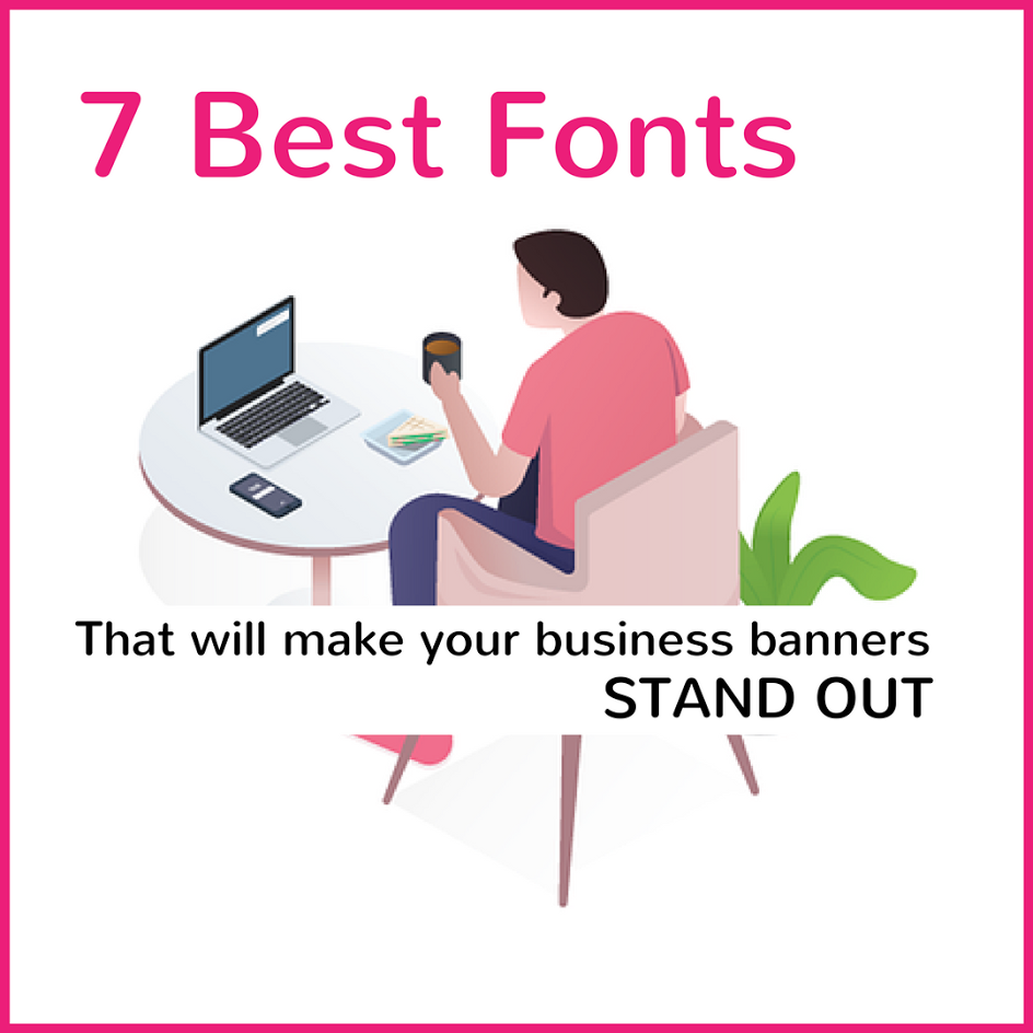
Banners are a luxury to all kinds of business meetings, conferences, trade shows, etc. These banners represent you and your company or the brand you work at. The banners are the first thing that will catch the eye of a person, and interactively creative design will attract the person to you and your company.
Best Fonts for Outdoor Banners
There are a lot of things to consider when a person is deciding to get a new banner for outdoor purposes. With various designs, layouts, and color combination strategies, one must not forget about the various fonts one can use.
Here are some of the best fonts which make your banner look elegant and attract customers:
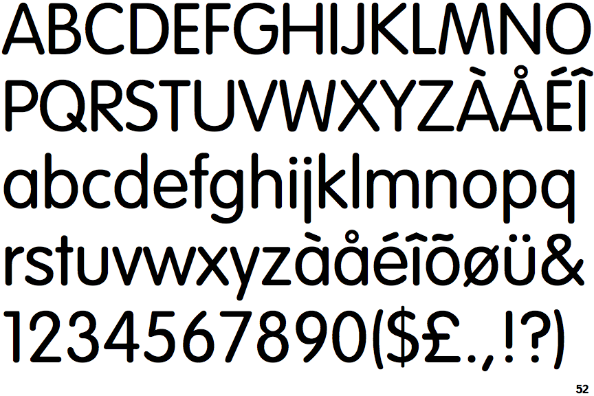
- Helvetica:
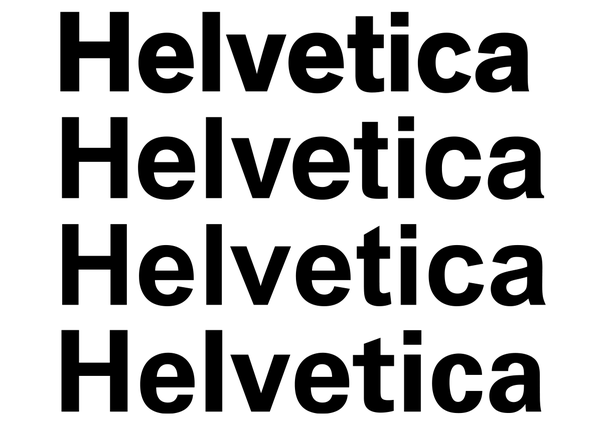
The font is one of the most heavily used fonts in the business of writing messages and printing them on banners. The font is tightly spaced and compact, giving you a good look for any occasion.
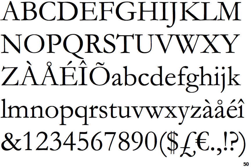
- Trajan:
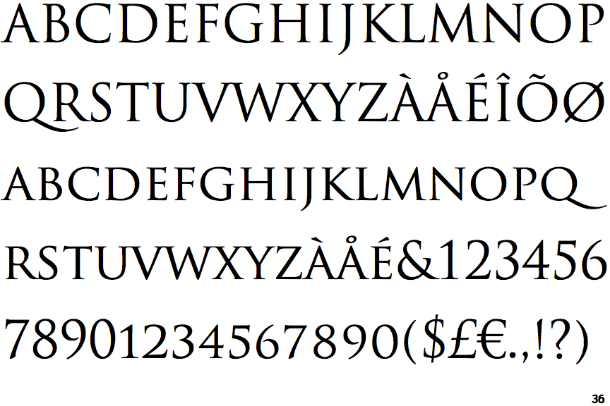
If you are a fan of serif styles, you must have come across this one. This is an old-fashioned serif style font, which offers sharp alphabets, and looks good for short messages and phrases. - Garamond:
This font is one of the most famous fonts to be used. Popular ever since its initial design, the font offers round edges and a classic look to the written content. This font has been highly used for textbooks, banners, newspapers, etc. Be it a short phrase or an entire message; this font will not let you down. - Bickham Script Pro:
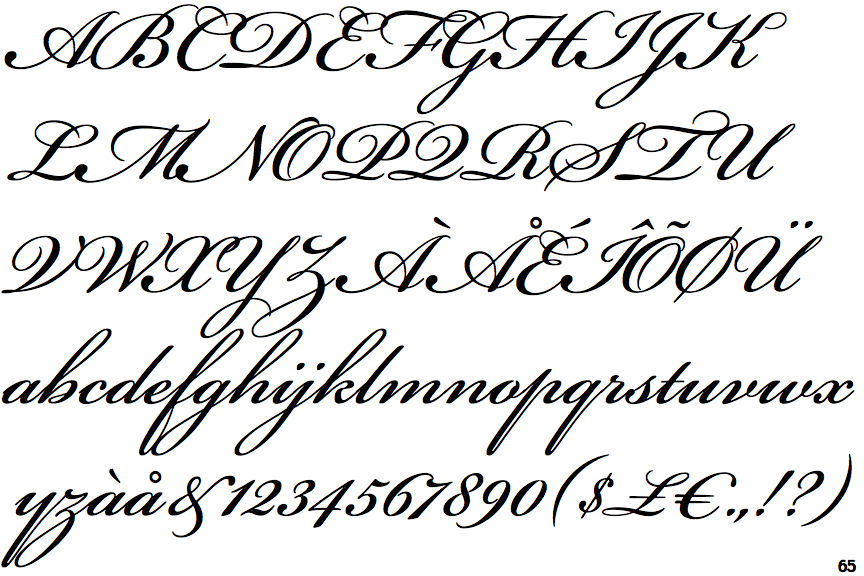
Cursive fonts? This is the one for you. Forget elegant and classic looks; this font makes your banner look premium styled, and adds a stylish flair to the beauty of your banner. With a slight slant towards the right, this font is bound to catch the eyes of everyone.
- Excelsior:
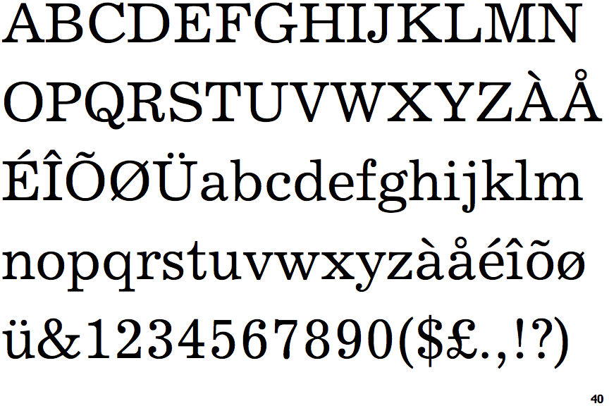
Great for bigger and formal banners, this is a well-balanced font style. This font will definitely add the formal elegance any banner will and may require.
- Perpetua:
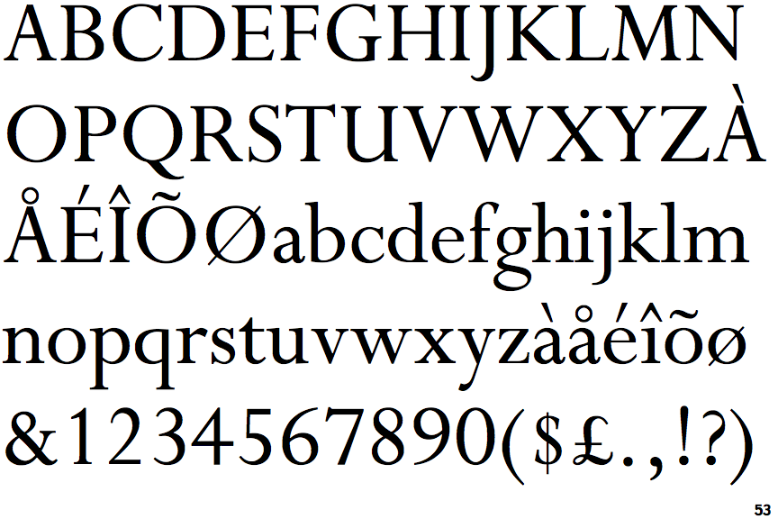
This fine lettered and highly contrasting style offers a great look too. Your formal as well as non-formal occasions. The contrast between the thick round strokes and the thin vertical lines makes it a good choice.
- Vag Rounded:
For short and sweet messages, this is the one of your banners. This well-rounded font offers depth to the content of the banner and is quite eye-catching, which makes this a good choice for your next banner.
What else to keep in mind during banner designing?
When you design a banner or get your banner designed, fonts matter, agreed. But there are other things that need be taken care of, here are some things to remember:
- Keep the purpose of the occasion in mind. Some fonts do not work for every kind of occasion.
- Background of the banner and the color combination. Banners are made to catch the eyes of the passerby, and with a bad combination, you may not get what you need.
- Remember that the design of the banner depends on the combination of various elements. Be it a roll down banner or teardrop styled banner; there are several things to keep in mind. And remember to use all of the aspects of designing in mind is important to create a visually appealing design and banner.
- A font which supports and complements your banner is what you require. The choice of the correct font will make all the difference for your beautiful banners.
- Keep the size of the banner in mind. Some of the fonts look amazingly good for small banners, but when we talk about large banners, you may need to reconsider.